Themes
Edit the tokens live, pick a look, import a shadcn theme.
Account
Update your profile and how the app notifies you.
Popover, muted and border roles drive the chrome around the card.
Passes the library audit:
- every role paints
- every shadow level paints its colour
- every number lays out
- every text pair clears its floor
- every decorative surface stays visible
- every data-series colour separates from its plot and from its neighbours under every colour-vision deficiency
- every token in a code block is readable on the fill it is read on
- every selection wash stays visible with readable text inside it
- every indicator mark is findable on the strip it is drawn on
- every find wash stands out
- every disabled control keeps its faded label
- every control the keyboard dim touches keeps a visible one
- every ladder stays in order
- the declared switch is findable
Reading the audit
mutedForeground on muted — 3.90:1 (needs 4.5:1). A ratio that cannot be
computed prints unmeasurable — a wash, not a pass; the prefix names the
report it came from.
Switch box:
switch height — 22 cannot hold a knob that needs 32
switch width — 0 cannot be laid out (needs a size greater than zero)
Edits are stored per mode over the platform style; a browser that refuses site storage keeps the editor. Reset clears them; Copy theme prints it.
The looks
Authored look
Bring a shadcn theme
import { shadcnTheme } from "@gpuixui/tokens";

const theme = shadcnTheme(css, "dark");
Default is shadcn's neutral theme, audited as warnings.
styles.css
Explore more in shadcn's builder and tweakcn.
@import "tailwindcss";@custom-variant dark (&:is(.dark *));:root { --background: oklch(1 0 0); --foreground: oklch(0.145 0 0); --card: oklch(1 0 0); --card-foreground: oklch(0.145 0 0); --popover: oklch(1 0 0); --popover-foreground: oklch(0.145 0 0); --primary: oklch(0.205 0 0); --primary-foreground: oklch(0.985 0 0); --secondary: oklch(0.97 0 0); --secondary-foreground: oklch(0.205 0 0); --muted: oklch(0.97 0 0); --muted-foreground: oklch(0.556 0 0); --accent: oklch(0.97 0 0); --accent-foreground: oklch(0.205 0 0); --destructive: oklch(0.577 0.245 27.325); --destructive-foreground: #FFFFFF; --border: oklch(0.922 0 0); --input: oklch(0.922 0 0); --ring: oklch(0.708 0 0); --chart-1: #5F4BDB; --chart-2: #1B45AC; --chart-3: #158754; --chart-4: #B57600; --chart-5: #A5262B; --radius: 6px;}.dark { --background: oklch(0.145 0 0); --foreground: oklch(0.985 0 0); --card: oklch(0.205 0 0); --card-foreground: oklch(0.985 0 0); --popover: oklch(0.205 0 0); --popover-foreground: oklch(0.985 0 0); --primary: oklch(0.922 0 0); --primary-foreground: oklch(0.205 0 0); --secondary: oklch(0.269 0 0); --secondary-foreground: oklch(0.985 0 0); --muted: oklch(0.269 0 0); --muted-foreground: oklch(0.708 0 0); --accent: oklch(0.269 0 0); --accent-foreground: oklch(0.985 0 0); --destructive: oklch(0.704 0.191 22.216); --destructive-foreground: #3A0B0D; --border: oklch(1 0 0 / 10%); --input: oklch(1 0 0 / 15%); --ring: oklch(0.556 0 0); --chart-1: #A7A9FF; --chart-2: #6E9CFF; --chart-3: #1FA968; --chart-4: #FFDE8A; --chart-5: #FF9E9E; --radius: 6px;}@theme inline { --color-background: var(--background); --color-foreground: var(--foreground); --color-card: var(--card); --color-card-foreground: var(--card-foreground); --color-popover: var(--popover); --color-popover-foreground: var(--popover-foreground); --color-primary: var(--primary); --color-primary-foreground: var(--primary-foreground); --color-secondary: var(--secondary); --color-secondary-foreground: var(--secondary-foreground); --color-muted: var(--muted); --color-muted-foreground: var(--muted-foreground); --color-accent: var(--accent); --color-accent-foreground: var(--accent-foreground); --color-destructive: var(--destructive); --color-destructive-foreground: var(--destructive-foreground); --color-border: var(--border); --color-input: var(--input); --color-ring: var(--ring); --color-chart-1: var(--chart-1); --color-chart-2: var(--chart-2); --color-chart-3: var(--chart-3); --color-chart-4: var(--chart-4); --color-chart-5: var(--chart-5);}The style reference
Flow and alignment
The box a row or a column is built from, and where its children sit. flex-1 grows and shrinks from a zero basis; min-w-0 lets a flex child shrink below its text.
| Class | Paints |
|---|---|
| flex | display: flex |
| inline-flex | display: flex |
| grid | display: grid |
| flex-row | flexDirection: row |
| flex-col | flexDirection: column |
| flex-col-reverse | flexDirection: column-reverse |
| flex-wrap | flexWrap: wrap |
| flex-1 | flexGrow: 1 · flexShrink: 1 · flexBasis: 0 |
| flex-grow | flexGrow: 1 |
| shrink-0 | flexShrink: 0 |
| items-start | alignItems: flex-start |
| items-center | alignItems: center |
| items-end | alignItems: flex-end |
| items-stretch | alignItems: stretch |
| justify-start | justifyContent: flex-start |
| justify-center | justifyContent: center |
| justify-between | justifyContent: space-between |
| justify-end | justifyContent: flex-end |
| self-start | alignSelf: flex-start |
| self-stretch | alignSelf: stretch |
| min-w-0 | minWidth: 0 |
| max-w-full | maxWidth: 100% |
| overflow-hidden | overflow: hidden |
Size
h-8, h-9, h-10 and size-9 read the theme's control heights, so the platform switch resizes a control instead of pinning Tailwind's 32/36/40. Every other length is a spacing step (4 is 16) or an [Npx] value.
| Class | Paints |
|---|---|
| h-8 | height: 24 |
| h-9 | height: 28 |
| h-10 | height: 32 |
| h-full | height: 100% |
| h-px | height: 1 |
| w-full | width: 100% |
| w-auto | width: auto |
| w-px | width: 1 |
| w-4 | width: 16 |
| min-h-6 | minHeight: 24 |
| min-w-6 | minWidth: 24 |
| max-w-sm | maxWidth: 384 |
| size-4 | width: 16 · height: 16 |
| size-9 | width: 28 · height: 28 |
Spacing
One step is four pixels. p-* sets all four sides, px-*/py-* a pair, and pl-*/pr-*/pt-*/pb-* one side; margins and gaps follow the same scale.
| Class | Paints |
|---|---|
| p-3 | padding: 12 |
| px-3 | paddingLeft: 12 · paddingRight: 12 |
| py-1 | paddingTop: 4 · paddingBottom: 4 |
| pl-2 | paddingLeft: 8 |
| pr-2 | paddingRight: 8 |
| pt-1 | paddingTop: 4 |
| pb-1 | paddingBottom: 4 |
| mx-2 | marginLeft: 8 · marginRight: 8 |
| my-4 | marginTop: 16 · marginBottom: 16 |
| mt-1 | marginTop: 4 |
| mb-2 | marginBottom: 8 |
| ml-1 | marginLeft: 4 |
| mr-1 | marginRight: 4 |
| gap-2 | gap: 8 |
| gap-x-3 | columnGap: 12 |
| gap-y-1 | rowGap: 4 |
Position
fixed compiles to absolute: GPUix paints an absolutely positioned element inside its parent, and has no viewport-fixed position. Percentages are refused (see below) because a native inset is a number.
| Class | Paints |
|---|---|
| relative | position: relative |
| absolute | position: absolute |
| fixed | position: absolute |
| inset-0 | top: 0 · right: 0 · bottom: 0 · left: 0 |
| inset-x-2 | left: 8 · right: 8 |
| inset-y-2 | top: 8 · bottom: 8 |
| top-2 | top: 8 |
| right-2 | right: 8 |
| bottom-2 | bottom: 8 |
| left-2 | left: 8 |
Grid
GPUix's grid takes an integer track count, not a template; grid-cols-3 is three equal tracks. Spans and named areas have no StyleDesc value and are refused by name below.
| Class | Paints |
|---|---|
| grid-cols-3 | gridTemplateColumns: 3 |
| grid-rows-2 | gridTemplateRows: 2 |
Surface, corner and edge
A colour name is a semantic role, and a /N suffix is that role at N% alpha. border-input is shadcn's hairline role (the token input is the field's fill). ring-* draws the runtime's one ring shape: a zero-blur shadow with no offset.
| Class | Paints |
|---|---|
| bg-card | backgroundColor: #26262A |
| bg-primary/90 | backgroundColor: #3B9DFFE6 |
| bg-transparent | backgroundColor: transparent |
| text-foreground | color: #EEF1F5 |
| text-muted-foreground | color: #C1C7D1 |
| border | borderWidth: 1 |
| border-2 | borderWidth: 2 |
| border-input | borderColor: #3A3A40 |
| border-strong | borderColor: #ACACB1 |
| border-t | borderTopWidth: 1 |
| rounded | borderRadius: 4 |
| rounded-lg | borderRadius: 14 |
| rounded-full | borderRadius: 9999 |
| shadow-md | boxShadow: one native shadow |
| shadow-xl | boxShadow: one native shadow |
| ring-1 | boxShadow: one native shadow |
Type
text-* is a size or a colour role: a size carries its own leading, and a role name paints the role. A face comes from the theme's two families, so font-sans follows the platform style.
| Class | Paints |
|---|---|
| text-xs | fontSize: 12 · lineHeight: 16 |
| text-sm | fontSize: 14 · lineHeight: 20 |
| text-base | fontSize: 16 · lineHeight: 24 |
| text-lg | fontSize: 18 · lineHeight: 28 |
| text-xl | fontSize: 20 · lineHeight: 28 |
| text-2xl | fontSize: 24 · lineHeight: 32 |
| text-3xl | fontSize: 30 · lineHeight: 36 |
| font-sans | fontFamily: .SystemUIFont |
| font-mono | fontFamily: Menlo |
| font-medium | fontWeight: 500 |
| leading-none | lineHeight: 1 |
| text-left | textAlign: left |
| text-center | textAlign: center |
| text-right | textAlign: right |
| underline | textDecoration: underline |
| whitespace-nowrap | whiteSpace: nowrap |
| text-ellipsis | textOverflow: ellipsis |
Pointer and selection
A class that opts an element out of the pointer, or marks the cursor it asks for. select-none is inherited, like the CSS property.
| Class | Paints |
|---|---|
| opacity-50 | opacity: 0.5 |
| pointer-events-none | pointerEvents: none |
| pointer-events-auto | pointerEvents: auto |
| cursor-pointer | cursor: pointer |
| cursor-not-allowed | cursor: not-allowed |
| select-none | userSelect: none |
State variants
A state prefix compiles to the record the GPUix host applies: hover/active nest inside the style, and focus, invalid, disabled, open and closed are separate styles a component turns on.
| Class | Paints |
|---|---|
| hover:bg-accent | hover.backgroundColor: #1A3D60 |
| active:bg-primary/80 | active.backgroundColor: #3B9DFFCC |
| focus-visible:ring-2 | focus.boxShadow: one native shadow |
| disabled:opacity-50 | disabled.opacity: 0.5 |
| aria-invalid:border-destructive | invalid.borderColor: #FF6B6B |
| data-open:bg-card | open.backgroundColor: #26262A |
A class that paints nothing
These resolve, and paint no property: outline-* clears a CSS outline the native style never draws, and dark: compiles to nothing because the theme already resolved light and dark at render time.
| Class | Paints |
|---|---|
| outline-none | no property |
| outline-hidden | no property |
| dark:bg-card | no property |
Refused, with the compiler's reason
A class the renderer cannot carry is kept in the result's unsupported list rather than dropped, and the reason comes from the compiler's own table — so an extension sees the same sentence a reader does.
| Class | Why it cannot paint |
|---|---|
| w-[calc(100%)] | calc() cannot express a percentage |
| top-1/2 | Percentage offsets and auto margins are not native numbers. |
| rotate-45 | GPUix `StyleDesc` has no `transform` (no rotate/scale/translate/skew); animate motion with `@gpuixui/motion`, static transforms are unsupported. |
| col-span-2 | GPUix grid has no span — only `gridColumnMin`/`gridRowMin` and integer `gridTemplateColumns`/`gridTemplateRows`; size the track or set an explicit width instead. |
| resize-none | GPUix has no user-resize handle; the textarea is fixed. |
| z-50 | Stacking order awaits the native zIndex slice. |
| sr-only | `sr-only` needs clipping and a 1px box the native style cannot express. |
| [--gap:0.75rem] | Arbitrary CSS variables, calc() and color-mix() have no StyleDesc value. |
| placeholder:text-muted-foreground | Pseudo-element rules have no native element to style. |
| [&_svg]:pointer-events-none | Child and sibling selectors are not part of an element's own StyleDesc. |
| transition-opacity | GPUix has no CSS transitions; motion props animate explicit styles. |
Browser table of the macOS theme: every value is compiled by `@gpuixui/tw` from the same theme the previews use, so the platform switch moves the heights, corners, colours and shadows a class paints. The shipped components paint these through GPUix, not the DOM.
Type scale
GPUIxUI
A landing or empty-state headline. One per screen.
Native components for desktop
The page title. The docs site's own heading is this role.
Typography is data
A section heading, and the level a long page repeats.
A subsection that carries weight
A card title or a subsection under an h2.
Every size, leading and weight here comes from the theme.
Running text — the default role of Text.
A lead sentence is body-sized, only heavier.
The first sentence of a section, or a value in a definition list.
Project name
A control's visible name, or a compact toolbar action.
Updated 2 minutes ago
Metadata and helper text, usually in the muted tone.
nub add @gpuixui/primitives
An identifier, command or path inside a sentence. Monospace.
const theme = themes.dark;
A block of code or terminal output. Monospace.
Browser preview of the macOS theme: the metrics are the token values and the families are that platform's. The shipped Text renders through GPUix, not the DOM.
Spacing, radius and density
Spacing
Gaps and padding between and inside elements.
2xs2pxxs4pxsm6pxmd8pxlg12pxxl16px2xl24px3xl32px4xl48px5xl64px
Radius
Corner radii a surface can take.
none0pxsm6pxmd10pxlg14pxxl18pxfull9999px
Borders
Hairline dividers and emphasised control edges.
thin1pxstrong2px
Icons
Square sizes for an icon beside text or a control.
xs12pxsm14pxmd16pxlg20pxxl24px
Elevation
One shadow per level; a surface reads it, never mixes it.
sm1 shadowmd1 shadowlg1 shadowoverlaynone (reserved)
Density
Control geometry per density preset. Type never changes.
| Preset | Height | Padding | Row |
|---|---|---|---|
| compact · active | 24/28/32 | 6/8/10 | 28px |
| comfortable | 28/32/36 | 8/10/12 | 32px |
| spacious | 32/36/40 | 10/12/14 | 36px |
Browser preview of the macOS theme: every value is read from `@gpuixui/tokens`, and the platform switch changes the radii and the density it resolves. The shipped components paint these in GPUix, not the DOM.
Blocks
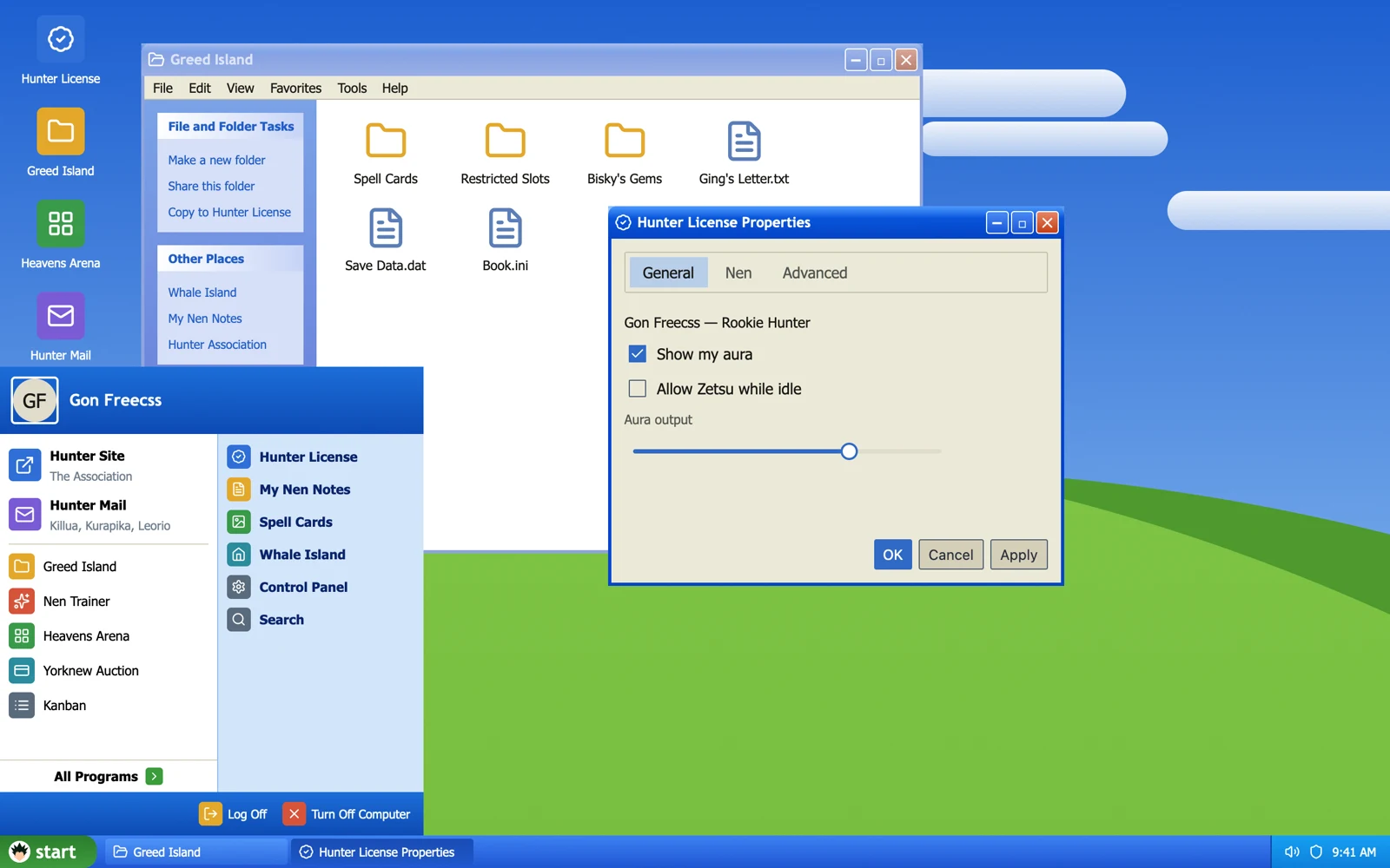
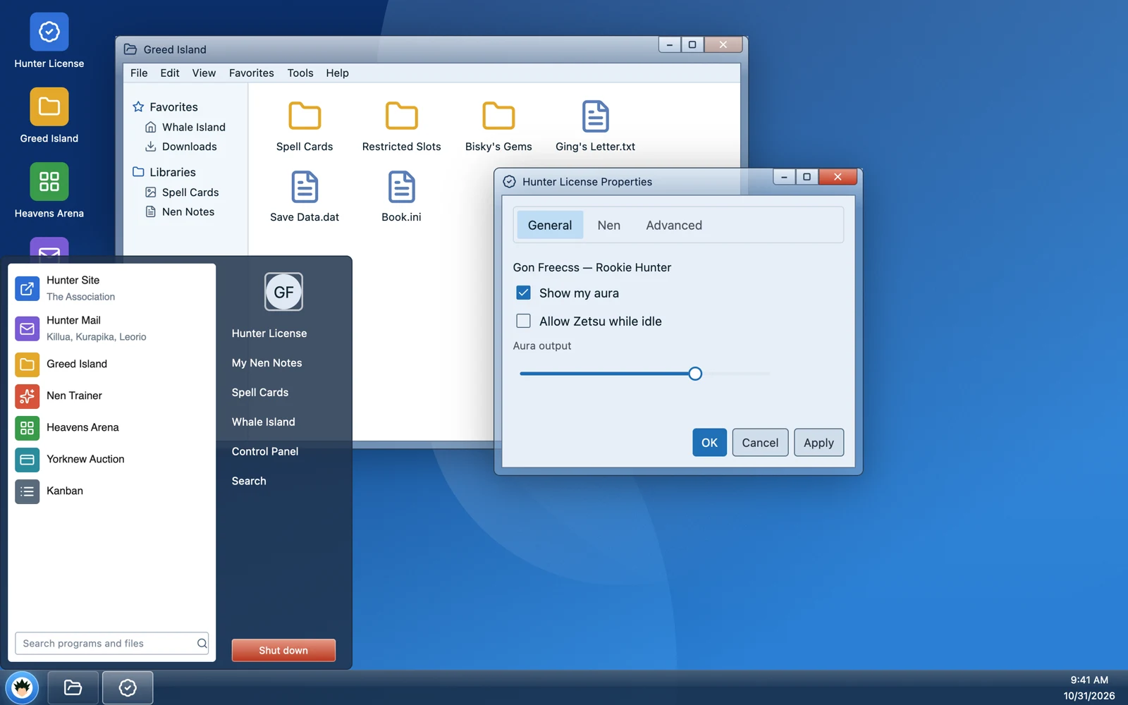
Block source on GitHubexamples/blocks/src/desktop/desktop.tsx
Edit this page on GitHubapps/docs/content/docs/themes.mdx